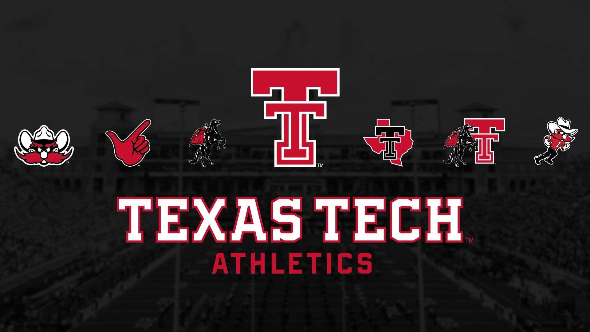
Texas Tech Athletics just announced a “new era” for the Red Raiders — not with a championship or new facilities, but with a modernized Double T logo and a whole “suite of athletic marks.” Because when you can’t fix the football team, at least you can fix the font.
The new design, which looks like someone pressed the old logo through Canva’s “flat” filter, will appear on all uniforms starting in 2026. Athletic Director Kirby Hocutt called it a “multi-year project,” which apparently required focus groups, brand audits, and an award-winning Dallas marketing firm. (Imagine explaining that invoice to a donor: “Yes, sir, your $50,000 paid for a slightly different red.”)
Of course, this branding odyssey wouldn’t be complete without corporate partnerships. Adidas, LDWW, and Torch Creative all pitched in — Adidas even designed three new fonts: “Pumpjack,” “Techsans,” and “Matador.” Because nothing says “West Texas grit” like spending a year naming fonts. And yes, Raider Red’s getting “refreshed” too, which probably means he’ll look a little less like Yosemite Sam and a little more like a Fortnite skin.
Fans will get their first chance to buy the new merch in April 2026, which gives them plenty of time to pretend they can tell the difference between this logo and the one they already have printed on every T-shirt, bumper sticker, and tortilla in Lubbock.
A “multi-year rebrand” to remove a bevel. At this rate, Jones Stadium’s Wi-Fi might be next on the modernization list — for 2030.
https://www.facebook.com/watch/?ref=embed_video&v=24700623606272270


